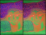
Pair of official promoter-issued 2nd and 3rd printing 14 x 21&7/8" concert posters for the Grateful Dead appearing with the Junior Wells Chicago Blues Band and the Doors at the Fillmore Auditorium in San Francisco, CA from 1/23-25/1967.
Art by Wes Wilson, image is # 45 in the Bill Graham/Fillmore series, these posters are currently designated RP-3 and OP-2 in the Eric King guide.
Medium flat vellum and medium-thin flat index stock posters are both in absolutely STUNNING near mint (A- to A-/B+) condition; aside from a couple of nearly-invisible hairline pinch/stress creases hiding around the image area/margins, they are UNBEATABLE examples- VERY sharp indeed.
As there has been some questions regarding the assorted printings of this poster, I'd like to present an independently-researched theory on how to tell the three printings apart. I have photos of everything described here, feel free to ask if you'd like to see any of them.
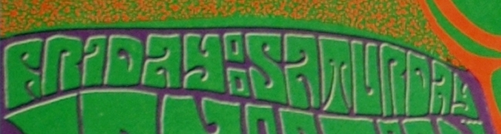
On the original (OP-1) there is no overlap of the red and green passes of ink just above "Friday Saturday", there is a clear separation. Virtually EVERY first OP-1 printing poster I viewed online shared the same trait (see photo for reference)
On both the 2nd and 3rd printings (what are currently being called OP-2 and RP-3), there is a slight horizontal overlap of the green and red passes of ink above "Friday Saturday", creating a thin dark line. I believe this is the result of a slight image shift between the first run and the subsequent runs. (*both of the posters in this lot share this trait, see photo for reference)
There is a tiny stripping error on the lower left edge of the "D" of "Auditorium" that carries over from the first printing to the thick black line/darkest purple lettering version with the "Friday Saturday" red/green overlap. It appears as a tiny "hump" along the lower left edge. This stripping error appears to be corrected on the thick black line/lightest purple lettering version, as there is no visible "hump", the edge appears to be clean. I believe this to be the final/3rd version. There may be a few more stripping differences, but this is the most consistent between all of them.
The version with the lighter blue/purple lettering and the corrected/no hump "D" has substantially finer typeset than the version with the darker purple lettering. This reverses the criteria regarding the current theory on thick versus thin type.
Both green/red overlap "Friday Saturday" versions (light and dark purple lettering) measure out to be virtually identical at 14" across and 21&7/8" long. Measured with multiple devices.
Casting aside the blacklight method (if you are at the poster show or in a record store and don't have access), here is how I am currently separating them;
A) No overlap line above "Friday Saturday", bumpy "D", thick purple line with thin black sliver along the top edge, thin BG credit -1st (OP-1)
B) Overlap line above "Friday Saturday", bumpy "D", thick black line along top edge, thick BG credit, darkest lettering- 2nd (OP-2) *right side of photo
C) Overlap line above "Friday Saturday", fixed "D", thick black line along top edge, thin BG credit, lightest lettering - 3rd (RP-3) *left side of photo